
The Printed Wrap category encompasses a wide range of commercial vehicles, spanning cars, vans, and planes, with a wide-ranging and creative variety of designs. The finished work must be digitally printed and feature intricate elements such as lettering, logos and symbols.
Whether in partial or full wraps, all of the designs are completely original and incredibly effective. Having taken into account factors such colour selection and the efficiency of the layout, all are exceptionally impactful vehicle wraps. The entrants have all showcased innovative and compelling designs that stand out in the dynamic and competitive landscape of commercial vehicle advertising.
We thank ADAPT, Amari Digital Printing Technologies, for their invaluable sponsorship of this category. Their commitment to excellence is evident in the expert advice and exceptional customer service they consistently provide. ADAPT stands as a pillar of support for the wide format print industry, offering a comprehensive range of products that cater to diverse needs.
From coloured vinyl to vehicle and architectural wraps, printable roll media, wrapping accessories, to large format printer inks, ADAPT ensures a one-stop solution with an impressive lineup of industry-leading brands such as 3M, Mactac, Orafol, and more.
ADAPT are passionate about providing excellent customer service. They are also passionate about providing their customers with the right product the first time. A proud member of the Vink group, ADAPT is one of the UK’s leading suppliers of roll media in the sign and display industry.
Elite Signs and Graphics develops design revolution for Alan Price Haulage
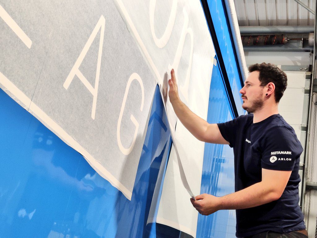
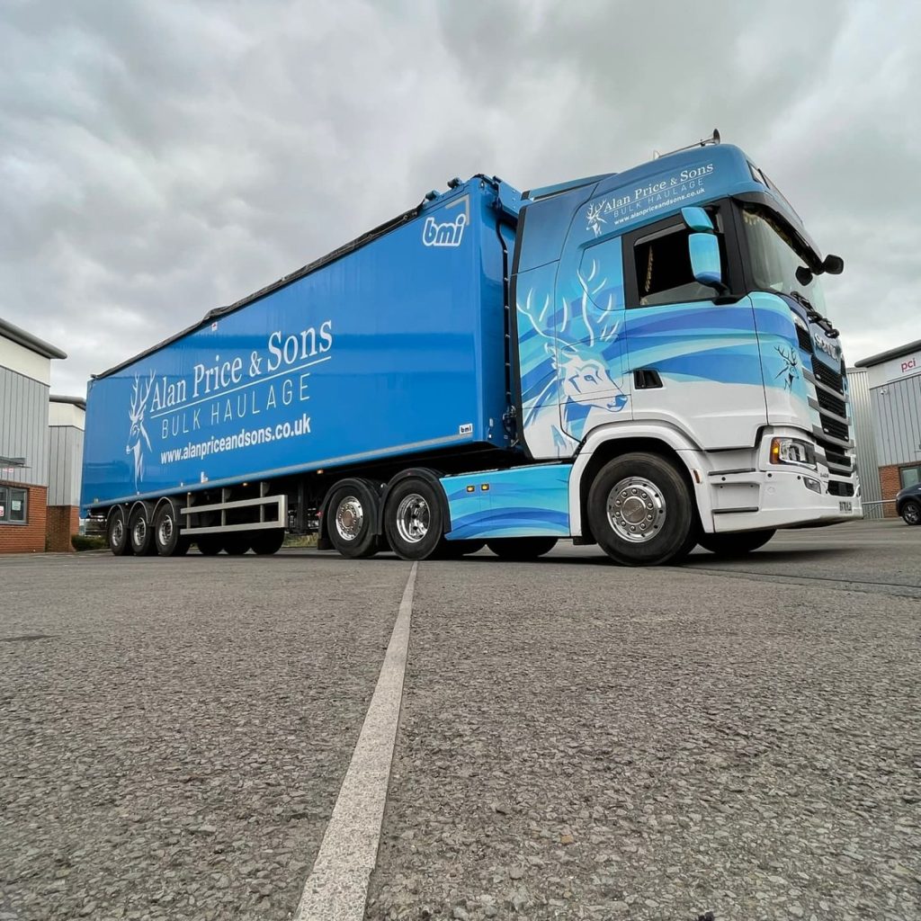
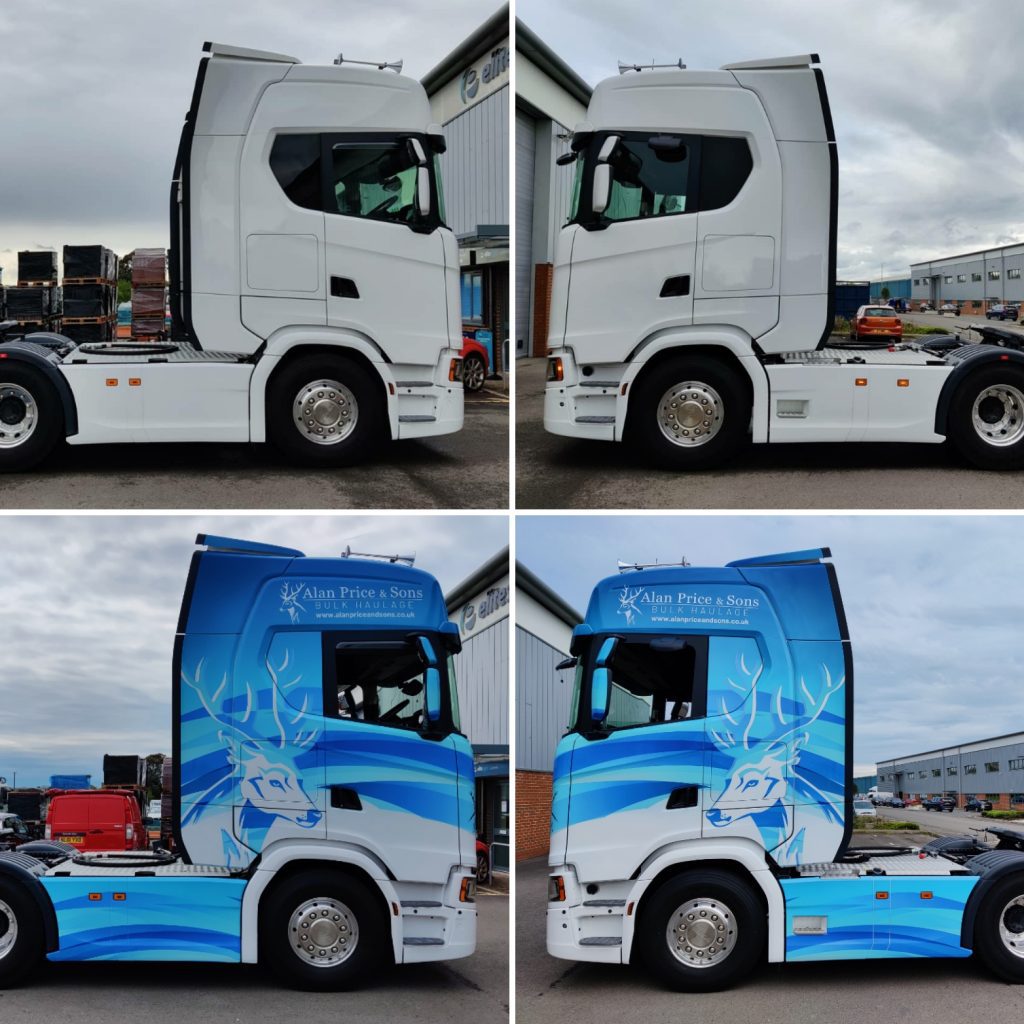
Elite Signs and Graphics transformed Alan Price Haulage’s fleet livery, shifting from traditional paint to a groundbreaking design featuring stylized deer. With a fleet of approximately seventeen vehicles based in Bargoed, South Wales, this in-house creation marks the start of a new tradition, reflecting the Price Family’s connection to deer farming. The intricate design, made feasible by modern print and materials technologies, defies the limitations of traditional methods. This eye-catching and environmentally conscious livery not only turns heads but also promotes wrapping as a medium. Elite Signs and Graphics is proud of exceeding expectations and garnering praise for a design that drives innovation in the vehicle livery market alongside its commitment to environmentally friendly practices.
Cube Branding tasked with wrapping 18 of these Merc HGV units for Forward Transport Solutions
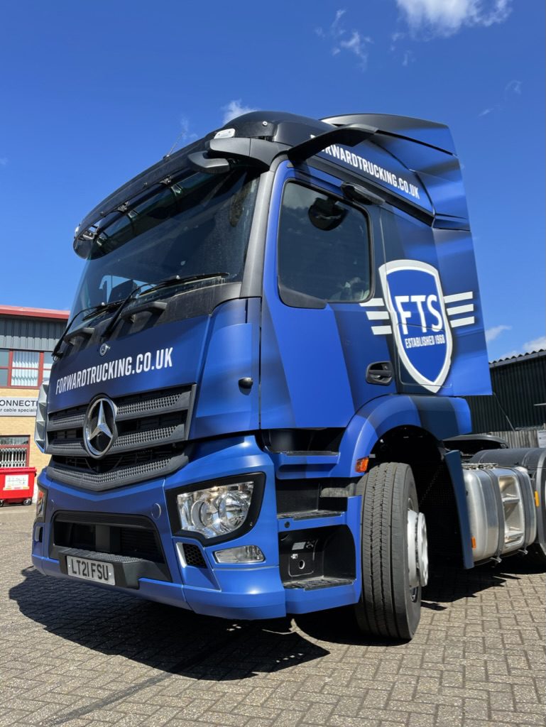
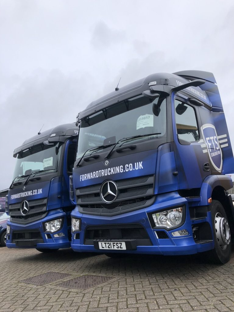
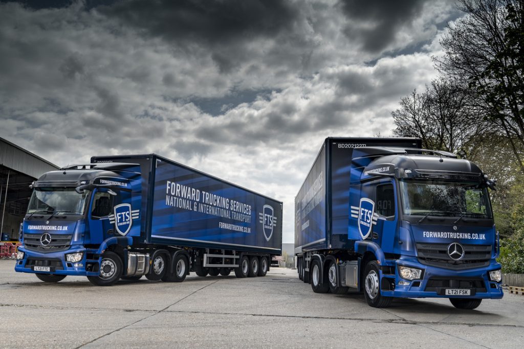
Cube Branding embarked on the challenge of transforming 18 Mercedes HGV units for Forward Transport Solutions. Engaged by their friends at Forward Transport Solutions, Cube Branding meticulously designed and finalised the layout through several revisions. Opting for IJ280 as the base material with a matte over laminate, the designs were brought to life using an Epson SureColor S80600. Cube Branding undertook the task of fully stripping and wrapping each truck in-house. To ensure a seamless appearance, each panel featured a distinct section of print, eliminating any visible joins. The newly branded trucks have garnered positive feedback, and Cube Branding anticipates wrapping an additional 20 units in the coming year, showcasing their expertise and commitment to delivering top-notch vehicle branding solutions.
Digital Deadline creates an eye-catching, stand out design for Joes Lawncare fleet
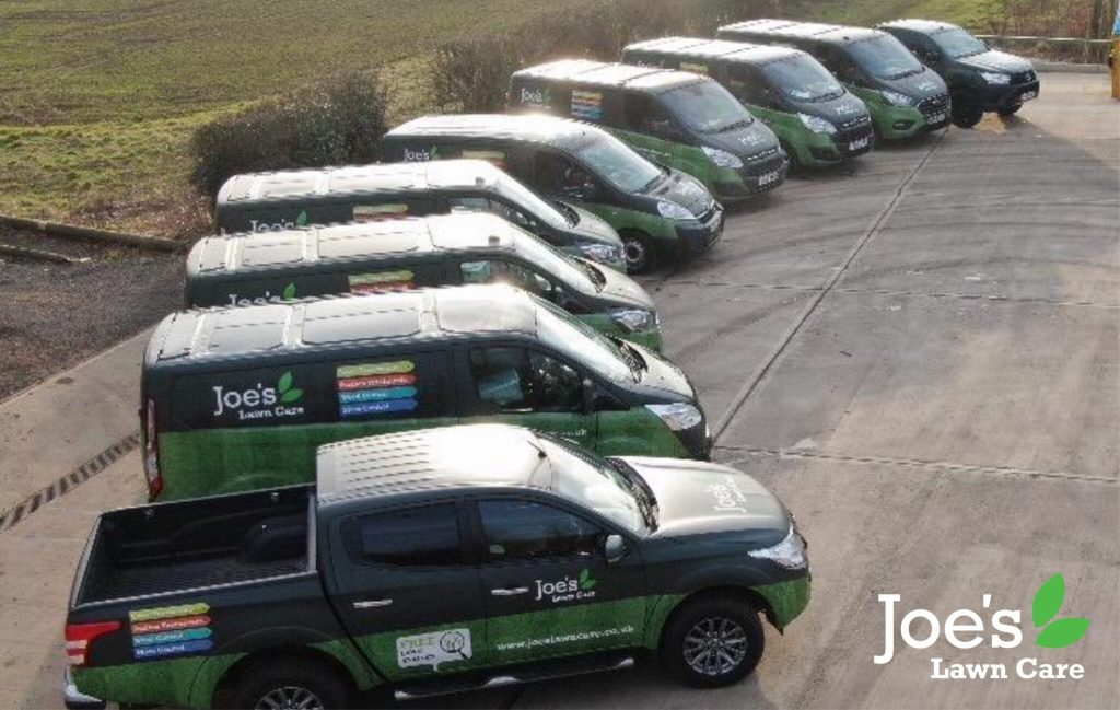
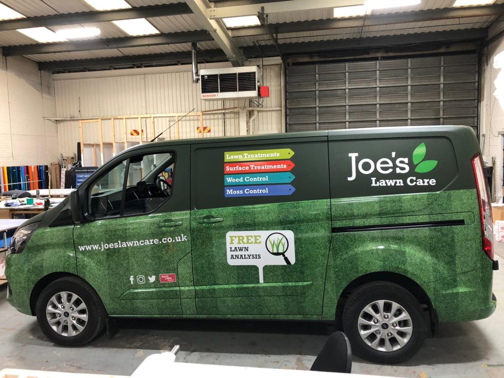
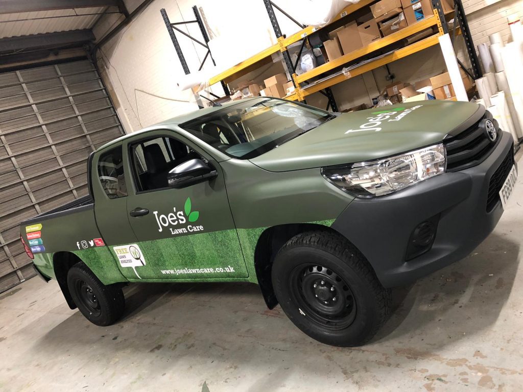
Digital Deadline took the helm in transforming Joes Lawncare fleet into a visual masterpiece. Tasked by a local lawn care company to elevate the presence of their vans nationwide, the designers embarked on a mission to craft a design that would seize attention. Melding various materials and printed vinyls, they conjured a distinctive look that transcended geographical boundaries. The grass-themed design, adorned with different finishes, emanated a refreshing change. Delving deeper into functionality, the team considered the wear and tear of the vans, ensuring that any minor damages could be easily rectified without the need for extensive panel rewrapping. The result was a fleet ready to conquer lawns and hearts across the country with its vibrant and resilient identity.
Mediafleet delivers Octopus Energy’s impactful and adaptable design for its vehicle fleet
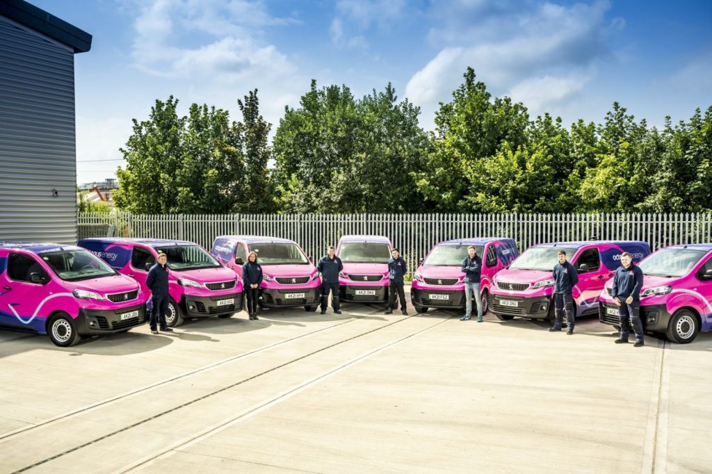
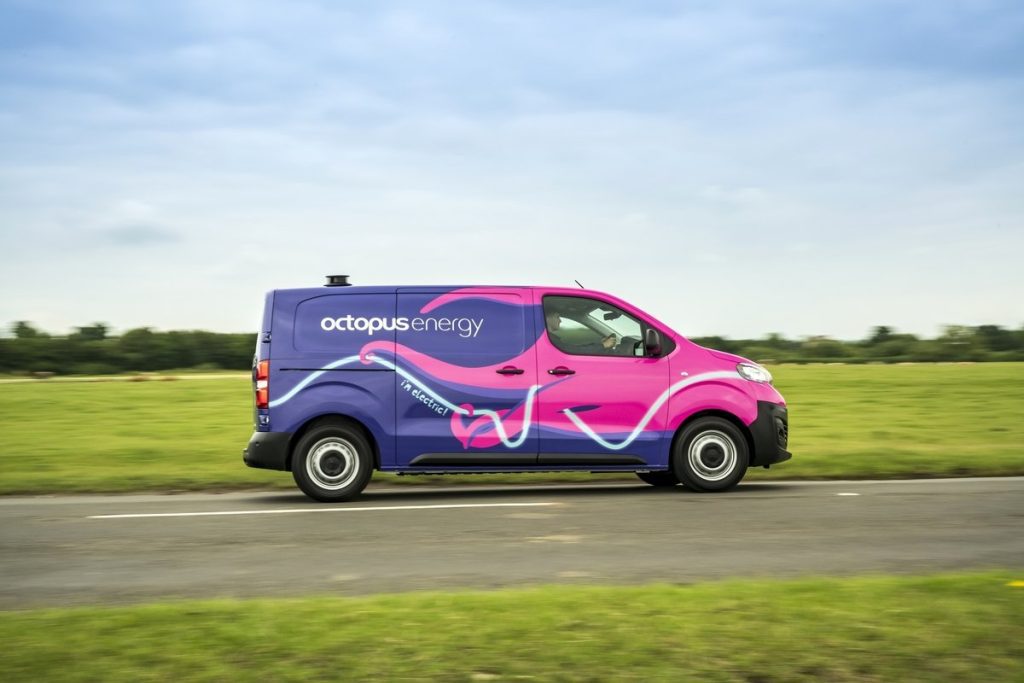
Mediafleet has been Octopus Energy’s chosen ‘vehicle branding partner’ since 2021. For this project, Octopus Energy’s marketing team crafted a versatile design for over 400 vehicles. The impactful and adaptive design employs blue and pink hues, which are playful and different, and consistent with their branding colours. Featuring the Octopus motif strategically, the designs promote various services like solar energy and electric vehicles. Reflective graphics ensure safety, with the vinyl application being a full wrap, even covering roofs, distinguishing it in various environments. Despite diverse vehicle models, the wrap treatment remains consistent. Mediafleet’s commitment extends to sustainability, using recyclable cast vinyl and managing end-of-life recycling, aligning with Octopus Energy’s environmental goals.
Paul Turner Signwriters revamp Ladyroyd Recovery Service Fleet with unique and flexible design
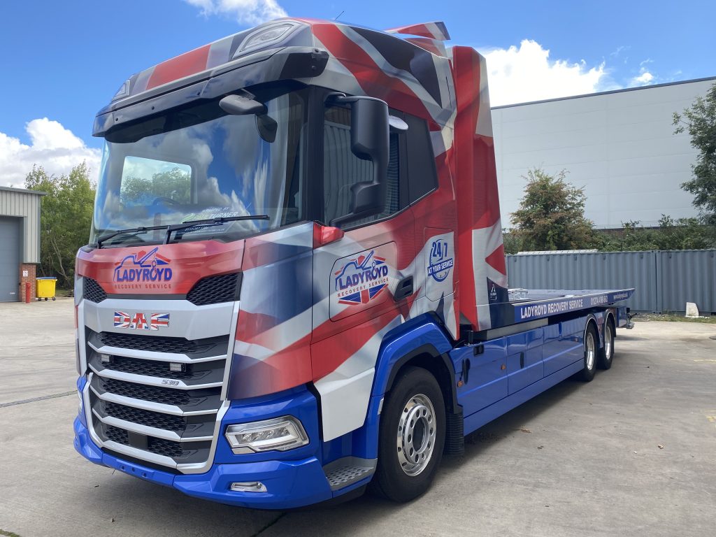
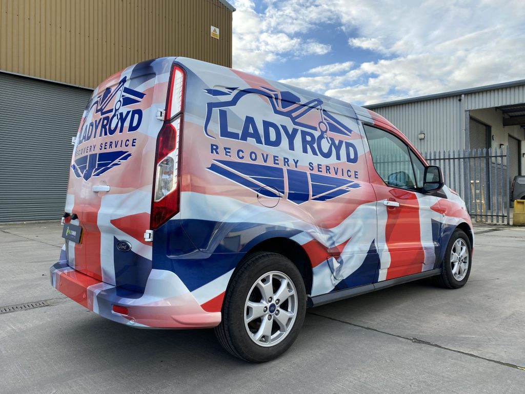
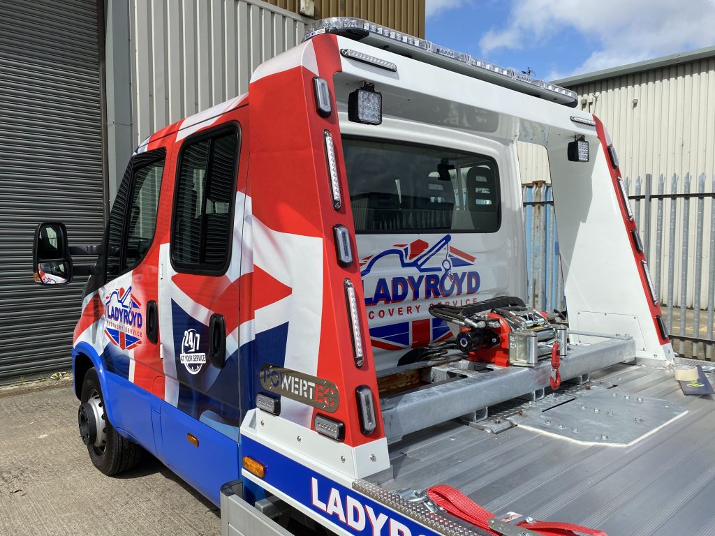
Paul Turner Signwriters transformed Ladyroyd Recovery Service’s fleet from basic vinyl text to eye-catching Union Jack-inspired designs. The challenge lay in adapting this unique concept to a diverse mix of vehicles, from the expansive DAF XF Recovery truck to the compact Ford Transit Connect. Precision and attention to detail were crucial, with adjustments made to enhance company details’ legibility. The team faced challenges aligning wrap elements on the recovery vehicle’s flatbed and cab. Regular consultations with Ladyroyd ensured the design met expectations. The project’s success was symbolised by the revamped DAF XF, driving away with a matching Ford Connect—a testament to cohesive fleet branding. The fleet, now adorned with iconic designs, embodies a seamless blend of precision, creativity, and consistent branding.
Sign Reload design new forecourt concept for Go Fuel fleet
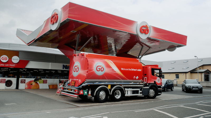
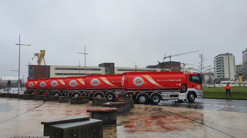
Sign Reload collaborated with long-term client Go Fuels to design a new forecourt concept, leading to a successful business boom with the rollout of the rebranded design. As Go Fuel expanded, the project evolved to include aviation fuel supply. The design team, guided by the new brand guidelines, ensured consistent application of logos and text lines. Materials like Oracle laminates, printable reflective for logos, carbon fibre, and vibrant colours were strategically chosen. Managing over 200 vehicles in the ongoing contract, attention to detail in logo placement and wrapping complex vehicle areas, such as the curved fuel tanker backs, demonstrated the team’s expertise. Meeting challenges with precision, the project featured metallic silver elements using Oracle 970 series.